| .. |
big
decorating
dreams. tiny
little
budget.
don't
be a wallflower! jump
on over to the discussion boards
and get decorating help.
|
| SiGN UP! join
the DigsNews mailing list + we'll keep you posted about updates and other DIGS-related news .
|
|
|
|
copyright ©1999-2006
DigsMagazine.com.
|
color-ama color
basics for the home decorating newbie
by Yee-Fan Sun |
1
2
3 4
continued from page
1
a brief glossary
of color terms
Design and decorating magazines can get hopelessly jargon-y in talking about
color, making something as simple as choosing what color to slipcover your hand-me-down
futon seem way more difficult than it actually needs to be. Here are some words
you might find bandied about as you wade through the expert advice. Don’t get
too hung up on them. The technical terms aren’t all that important, but getting
comfortable with the lingo can be useful in easing the intimidation factor, and
opening your eyes to the vast variety of colors that are out there.
hue: Hue is the
basic pure color; this is what most of us are talking about when we talk about color – red, orange, yellow, blue, green,
violet … you
get the picture.
saturation: This
describes the intensity of a color; think of this as how much color
is in your color. A vibrant tomatoey red, for example, would be considered
a lot more saturated a red than a muted brick red. Bear in mind that
saturation is not the same thing as darkness; a terracotta pot is
darker than the skin of a ripe orange, but the orange is far more
saturated. The more saturated the color, the more punch it’ll pack.
value: Value
deals with the darkness or lightness of a color, which is affected
by how much white or black has been mixed into a given hue.
Related to value are the terms tint (how much
white is in a color) and shade (how much black
is in a color). Unless you’re going to become a serious color
theory geek, there’s no real need to distinguish amongst these
last two terms. Lighter-value colors tend to be more subtle;
darker-value colors tend to be richer.
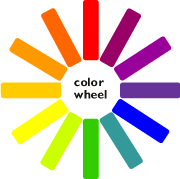
freewheeling:
the color wheel
You’ve
probably seen it before: that pretty circle of rainbow colors.
Amongst those who like to obsess over all things color, it’s known
as the color wheel, and getting acquainted with it is a good first
step towards understanding how different colors relate to each
other. The color
wheel is basically composed of three different sets of colors.
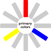
At its core are the primary colors we all learned about in
elementary school -- the ol’ red-yellow-blue -- which can’t
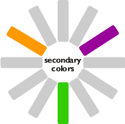
be generated by mixing other colors together. Next up are the
secondary colors -- green, orange, and violet -- which you
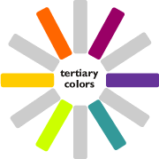
get by mixing the primaries. Lastly there are the tertiary
colors, which are the lovely in-between colors you get by mixing
primaries with secondaries. |
|
Truth be told,
however, I’ve never found the primary/secondary/tertiary distinctions
to be all that important or useful in choosing my color schemes.
All you really need to know about the color wheel is this: colors
that sit close to one another on the color wheel look more similar;
ones that sit farther away look more different. So, if you want colors
that’ll blend together subtly, you should choose colors that sit
close together on the color wheel; when you’re looking for a color
that will pop dramatically against another, you’ll choose one that
sits far away from it. Easy-breezy, no?
don't
stop skedaddling...
--------------------------->
lounge . nourish .
host
. laze . home.
|